Check out the resources page on the course website for some additional books, videos, and articles on designing effective UIs.

EDS 296: Part 5
User-centered design
UX/UI matters
When designing your app, it’s critically important that you consider your user’s needs and how they will interact with your app – it doesn’t matter how innovative you back-end computations are if people don’t understand how to use your app!
Learning Objectives - UX/UI Design
By the end of this section, you should:
have a checklist of considerations to reference each time you build an app
have a general understanding of what web accessibility means and who it can benefit (spoiler alert: it benefits us all!)
know how to make a few small tweaks / updates to your application to make it more accessible for all users
Tips for designing your Shiny apps
Chapters 6 and 7 of Engineering Production-Grade Shiny Apps provide a list of considerations as you embark on your app-building journey. A few big ones:
{shinyjs} package for implementing nifty ways to improve the user experience of your shiny apps.plotly) – interactivity adds visual noise, so it’s best to not make elements interactive if there is no value is gained.Looking for more resources?
Check out the resources page on the course website for some additional books, videos, and articles on designing effective UIs.
Building accessible apps
Consider web accessibilty guidelines to ensure that your app is usable by all
What is web accessibility?
From the World Wide Web Consortium (W3C)’s Introduction to Web Accessibility:
Web accessibility means that websites, tools, and technologies are designed and developed so that people with disabilities can use them. More specifically, people can:
perceive, understand, navigate, and interact with the Web
contribute to the Web
Web accessibility encompasses all disabilities that affect access to the Web, including: auditory, cognitive, neurological, physical, speech, and visual
Web accessibility also benefits people without disabilities, for example:
people using mobile phones, smart watches, smart TVs, and other devices with small screens, different input modes, etc.
older people with changing abilities due to ageing
people with “temporary disabilities” such as a broken arm or lost glasses
people with “situational limitations” such as in bright sunlight or in an environment where they cannot listen to audio
people using a slow Internet connection, or who have limited or expensive bandwidth
Check out the A11Y Project for lots of great tutorials and information about web accessibility.
Small changes can lead to tangible increases in functionality for all users
Ensuring that your shiny apps are accessible can feel overwhelming – but considering even a few small changes can have a large impact on user experience.
The following suggestions have been borrowed and adapted from Ch. 6.3 - Web Accessibility from Engineering Production-Grade Shiny Apps, by Colin Fay, Sèbastien Rochette, Vincent Guyader, & Cervan Girard:
Use HTML elements appropriately (e.g. consider hierarchy)
Include alt text for graphical elements
Consider navigation from a mobility perspective
Use colorblind-friendly palettes

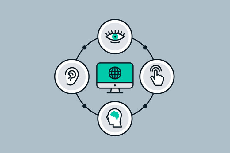
Image Source: Accessibility Stack
Use HTML elements appropriately
Screen readers use HTML elements to understand web page organization. Header elements create hierarchy within a webpage and are used by screen readers (i.e. devices used by those with visual impairments) to understand a page’s organizational structure. An <h1> element is more important (hierarchically speaking) than an <h2>, which is more important than an <h3>, and so on.
# load packages ----
library(shiny)

# user interface ----
ui <- fluidPage(
  tags$h1("This is my app's title"),

  tags$h2("Section 1"),

  tags$h3("Sub-section a"),

  tags$h3("Sub-section b"),

  tags$h3("Sub-section c"),

  tags$h2("Section 2"),
)

# server instructions ----
server <- function(input, output) {}

# combine UI & server into an app ----
shinyApp(ui = ui, server = server)
Ideally, you would only have one <h1> element (e.g. your app’s title), a small number of <h2> elements, more <h3> elements, and so on. See the minimal example, to the left.
You should not rely on headers for styling purposes – for example, you should not use a level-one header elsewhere in your app just because you want larger text. Instead, use CSS to increase text size (refer to the Customizing Quarto Websites workshop for instruction on how to construct CSS selectors for styling HTML elements).
Include alt text with all graphical elements
All images and graphical elements should include alternative (alt) text that describe the image and / or information being represented. This text won’t appear in the UI, but is detected and read by screen readers.
Include the alt argument (similar to adding the alt attribute to an HTML element) when using renderPlot() to add alt text to your reactive plots – the alt argument lives outside of the {} but inside the (). For example:
Tips on writing alt text for data visualizations
A good rule of thumb for writing alt text for data visualizations is alt=“Chart type of type of data where reason for including chart” (see this post by Amy Cesal for more). One example:
alt=“Bar chart of gun murders per 100,000 people where America’s murder rate is 6 times worse than Canada, and 30 times Australia”
For more great tips on how and when to use alt text, check out this article by the A11Y Project. For examples of how to construct good alt text, take a peek at this resource by Datawrapper.
Consider UI navigation for those with mobility impairments
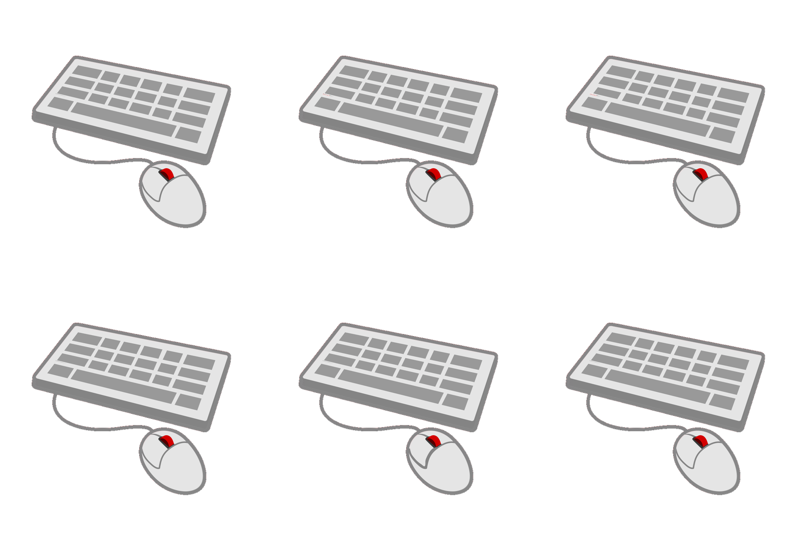
For users with mobility impairments, using a mouse to navigate a UI packed with widgets may be challenging – some users may even be exclusively using a keyboard to navigate the web.
Ideally, actions required of your user can be done using a keyboard (e.g. pressing a button in the UI) – however from a new shiny developer standpoint, this may be technically challenging to implement (the authors of Engineering Production-Grade Shiny Apps suggest the {nter} package for building shiny action buttons that can be triggered by pressing enter, however, at the time of building this workshop, the package source code hadn’t been updated since 2019).
At a minimum, consider spacing out and / or limiting the number of widgets on any given page to make navigation with a mouse as easy as possible.

Use colorblind-friendly palettes
About 1 in 12 males and 1 in 200 females have some form of colorblindness (Wikipedia). Ensuring that your color choices are distinguishable from one another and / or providing an additional non-color-based way (e.g. patterns, shapes) of distinguishing between groups is critical.
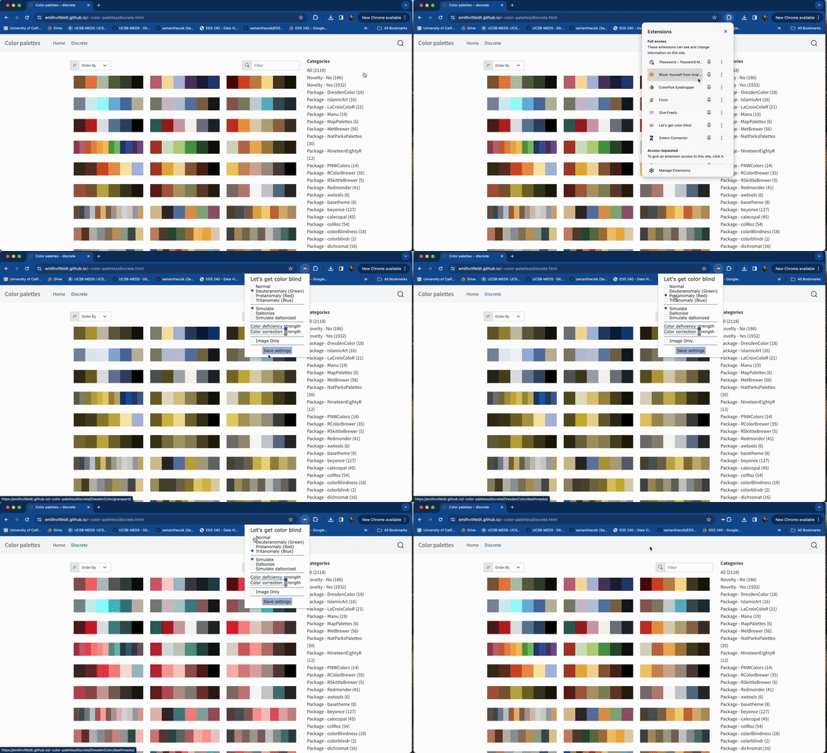
There are lots of great colorblind-accessible palettes and resources (check out this one by Alex Phillips, as well as the {paletteer} package, a near comprehensive collection of all R color palette packages). Using the Let’s get color blind Google Chrome extension can help you quickly assess the accessibility of you visualizations / apps.

Using Google Chrome’s Let’s get color blind extension to simulate different types of color blindness
End part 5
Up next: streamlining code
05:00