Pros:

We’ll be doing a rather high-level and quick overview of Sass & CSS today, though I encourage you to check out the Customizing Quarto Websites workshop materials, which takes a much deeper dive (the information in that workshop is largely applicable here).
W3Schools is my favorite online resource for all-things CSS – in addition to really digestible descriptions and examples, they also offer interactive tutorials to get your hands on updating (and breaking) code (in a safe space, of course).

CSS (Cascading Style Sheets) is a programming language that allows you to control how HTML elements look (e.g. colors, font styles, etc.) on a webpage.

Sass (Syntactically Awesome Stylesheets) is a CSS extension language and CSS preprocessor – meaning Sass needs to be converted (aka compiled) to CSS before it can be interpreted by your web browser.
CSS is a rule-based language, meaning that it allows you to define groups of styles that should be applied to particular elements or groups of elements on a web page. For example, “I want all level one headings (<h1> or tags$h1(), as written in Shiny) in my app to be green with a bit of extra space between each letter” could be coded as:
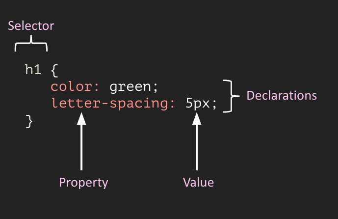
Selectors select the HTML element(s) you want to style (e.g. level one headings, <h1>)
Declarations sit inside curly brackets, {}, and are made up of property and value pairs. Each pair specifies the property of the HTML element(s) you’re selecting (e.g. the color property of the element <h1>), and a value you’d like to assign to that property (e.g. green)
A property and it’s corresponding value are separated by a colon, :. Declarations end with a semicolon, ;
There are a variety of CSS selectors – check out some of the basics that will take you far in styling your apps, starting on this slide of the Customizing Quarto Websites workshop.
Add styling directly to tags. It’s best not to use a lot of these! It’s easy to lose track of your “in-line” styling in large projects, you can’t reuse rules easily, it’s hard to keep styling consistent, and it’s difficult to implement large stylistic changes.
#..............................setup.............................
library(shiny)

#...............................ui...............................
ui <- fluidPage(

  # text color = purple
  tags$h1("My app title",
          style = "color: #711EBA;"),

  # text color = blue; increase space between letters
  tags$h3("Section 1",
          style = "color: #1E4DBA; letter-spacing: 4px;"),

  # no styling
  tags$h3("Section 2"),

  # increase border thickness and color green; round corners
  tags$button("This is a button",
              style = "border: 2px solid #1EBA38; border-radius: 5px")

)

#.............................server.............................
server <- function(input, output) {}

#......................combine ui & server.......................
shinyApp(ui, server)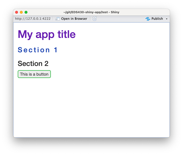
Add CSS rules to your app’s header (tags$head). This is a little bit better than option 1 since it allows for the reuse of rules, however, styles can’t be cached (i.e. saved for future usage when you reopen your app). Note: explore Google fonts and check out this slide for instructions on selecting a font.
#..............................setup.............................
library(shiny)

#...............................ui...............................
ui <- fluidPage(

  tags$head(
    tags$style("

      @import url('https://fonts.googleapis.com/css2?family=Lobster&display=swap');

      h1 {font-family: 'Lobster', cursive;}

      h3 {color: blue;}

      .wide-letters {letter-spacing: 4px;}

    "
    ) # END styles
  ), # END head

  tags$h1("My app title"),

  tags$h3("Section 1"),

  tags$h3(class = "wide-letters", "Section 2"),

  tags$button("This is a button")

)

#.............................server.............................
server <- function(input, output) {}

#......................combine ui & server.......................
shinyApp(ui, server)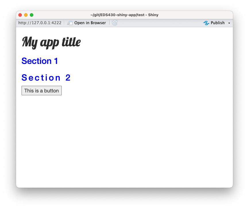
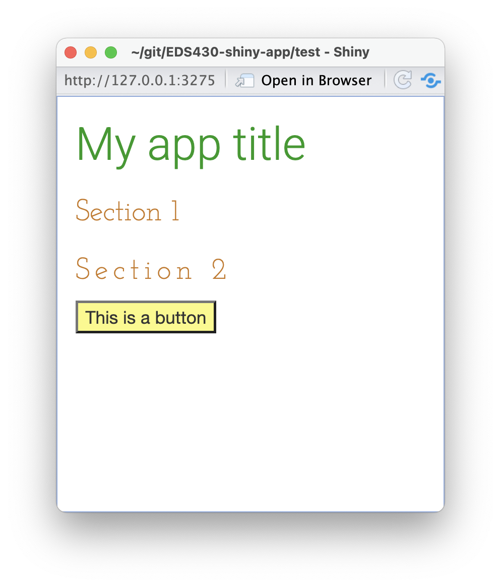
Build a stylesheet (a .css file) inside your app’s www/ directory and apply your styles to your app’s header (for shinydashboards, include your header inside dashboardBody(). This is the most ideal approach – it allows for style reuse, caching, and keeps styling contained in one spot. Tip: use touch styles.css in the terminal to create a new .css file.
~/myApp/app.R
#..............................setup.............................
library(shiny)

#...............................ui...............................
ui <- fluidPage(

  tags$head(
    tags$link(rel = "stylesheet", type = "text/css", href = "styles.css")
  ),

  tags$h1("My app title"),

  tags$h3("Section 1"),

  tags$h3(class = "wide-letters", "Section 2"),

  tags$button("This is a button")

)

#.............................server.............................
server <- function(input, output) {}

#......................combine ui & server.......................
shinyApp(ui, server)
~/myApp/www/styles.css
/*import google fonts (Josephine Slab (serif) & Heebo (sans serfi))*/
@import url('https://fonts.googleapis.com/css2?family=Heebo:wght@300&family=Josefin+Slab:wght@300&display=swap');

/* element selectors */
h1 {
  font-family: 'Heebo', sans-serif;
  color: #179A1F; /* green */
}

h3 {
  font-family: 'Josefin Slab', serif;
  color: #CA781C; /* orange */
}

button {
  background-color: #FCF982; /* yellow */
}


/* class selectors */
.wide-letters {
  letter-spacing: 4px;
}
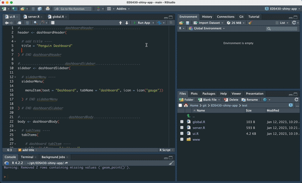
Create a new subdirectory called css-dashboard/, and add the following ui.R, server.R, and global.R files.
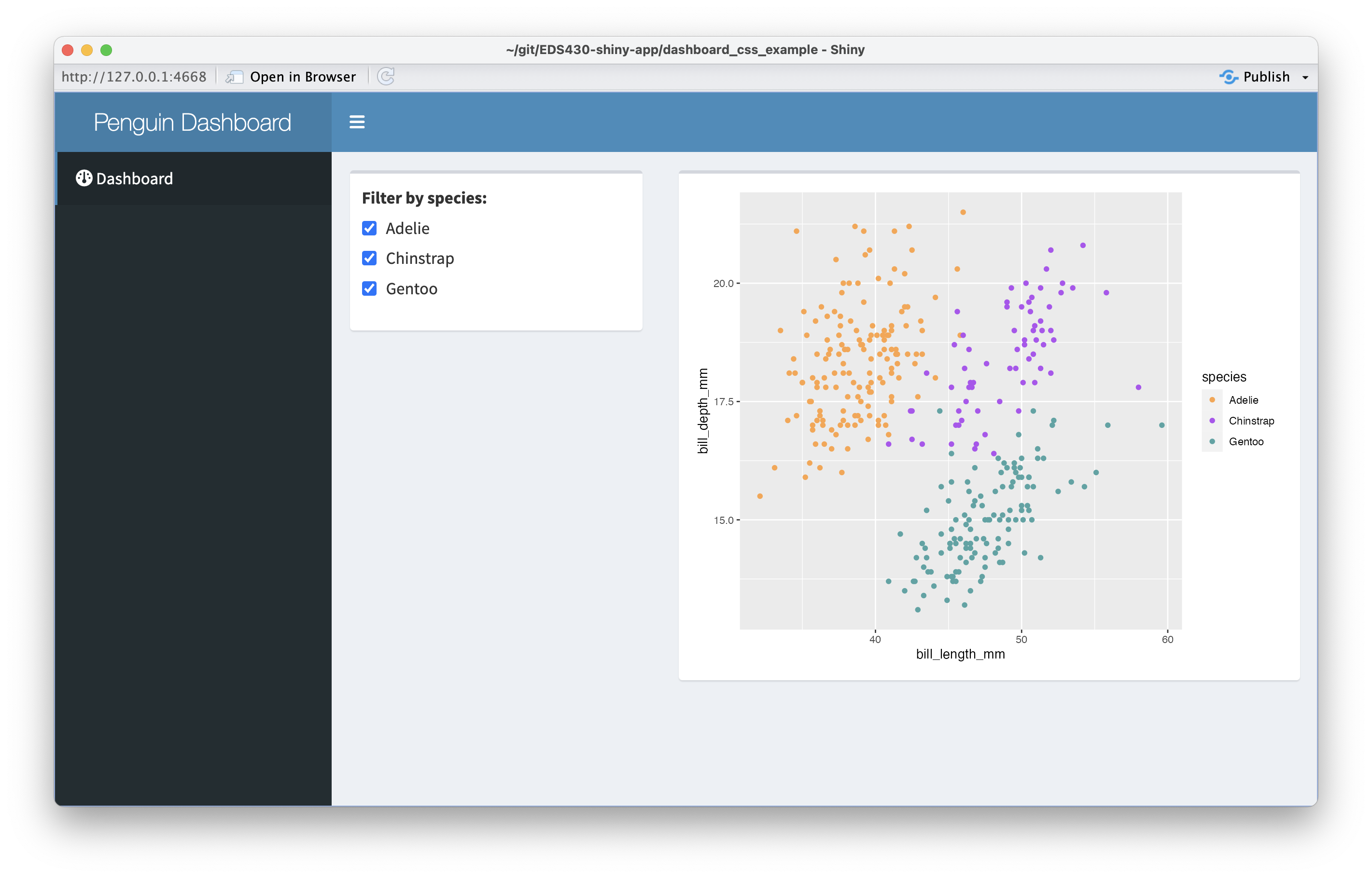
~/css-dashboard/ui.R
#........................dashboardHeader.........................
header <- dashboardHeader(

  # add title ----
  title = "Penguin Dashboard"

) # END dashboardHeader

#........................dashboardSidebar........................
sidebar <- dashboardSidebar(

  # sidebarMenu ----
  sidebarMenu(

    menuItem(text = "Dashboard", tabName = "dashboard", icon = icon("gauge"))

  ) # END sidebarMenu

) # END dashboardSidebar

#..........................dashboardBody.........................
body <- dashboardBody(

  # tabItems ----
  tabItems(

    # dashboard tabItem ----
    tabItem(tabName = "dashboard",

            # fluidRow ----
            fluidRow(

              # input box ----
              box(width = 4,

                  checkboxGroupInput(
                    inputId = "penguin_species_input",
                    label = "Filter by species: ",
                    choices = c("Adelie", "Chinstrap", "Gentoo"),
                    selected = c("Adelie", "Chinstrap", "Gentoo")

                  ) # END checkboxGroupInput

              ), # END input box

              # output box ----
              box(width = 8,

                  plotOutput(outputId = "penguin_scatterplot_output")

              ) # END output box

            ), # END fluidRow

    ) # END dashboard tabItem

  ) # END tabItems

) # END dashboardBody

#..................combine all in dashboardPage..................
dashboardPage(header, sidebar, body)
~/css-dashboard/server.R
server <- function(input, output) {

  # penguin spp reactive df----
  penguin_spp <- reactive({

    na.omit(penguins) |>
      filter(species %in% input$penguin_species_input) |>
      select(species, island, bill_length_mm, bill_depth_mm)

  }) # END penguin spp reactive df


  # plot ----
  output$penguin_scatterplot_output <- renderPlot({

    ggplot(penguin_spp(), aes(x = bill_length_mm, y = bill_depth_mm, color = species)) +
      geom_point() +
      scale_color_manual(values = c("Adelie" = "#FEA346", "Chinstrap" = "#B251F1", "Gentoo" = "#4BA4A4"))

  }) # END plot

}
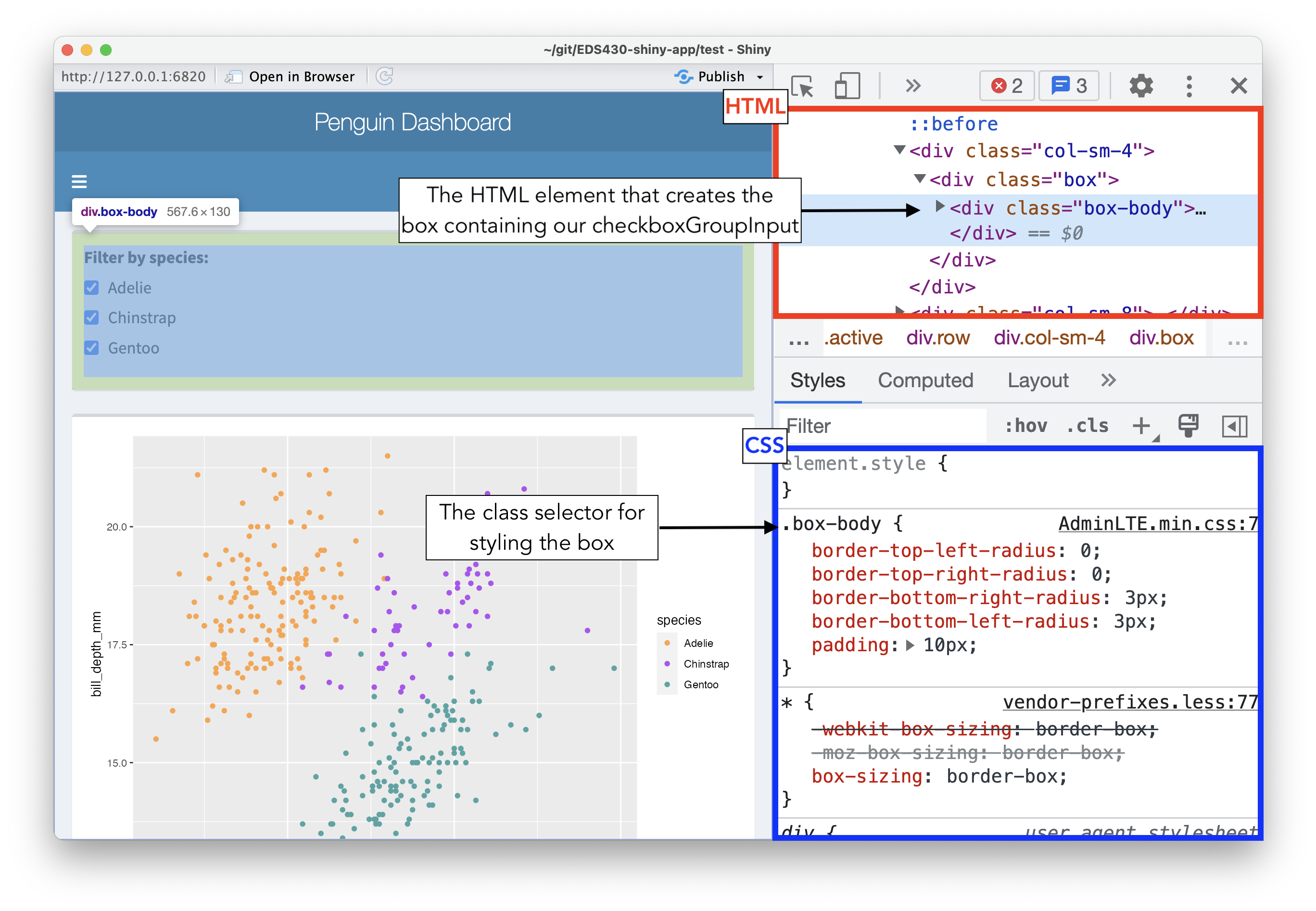
Oftentimes, you’ll have to do a bit of exploration to determine how to target specific elements for styling. In either your app viewer or web browser, right click on an element of interest > choose Inspect (or Inspect Element) to open up the underlying HTML and CSS. You can make temporary edits to your app (e.g. adding a background color, changing font sizes, etc.) to see how they look first, then copy the appropriate CSS rule into your stylesheet to apply to your app.
Now that we know that we can use the .box-body class to customize the appearance of our boxes, let’s create a stylesheet inside our www/ folder and add our new CSS rule. The shinydashboard framework already provides the “standard” styling for boxes, contained in the .box-body class. Anything we specify in our own stylesheet will build upon or modify existing styling.
Remember to create a header and link your stylesheet within dashboardBody() to apply our styles.
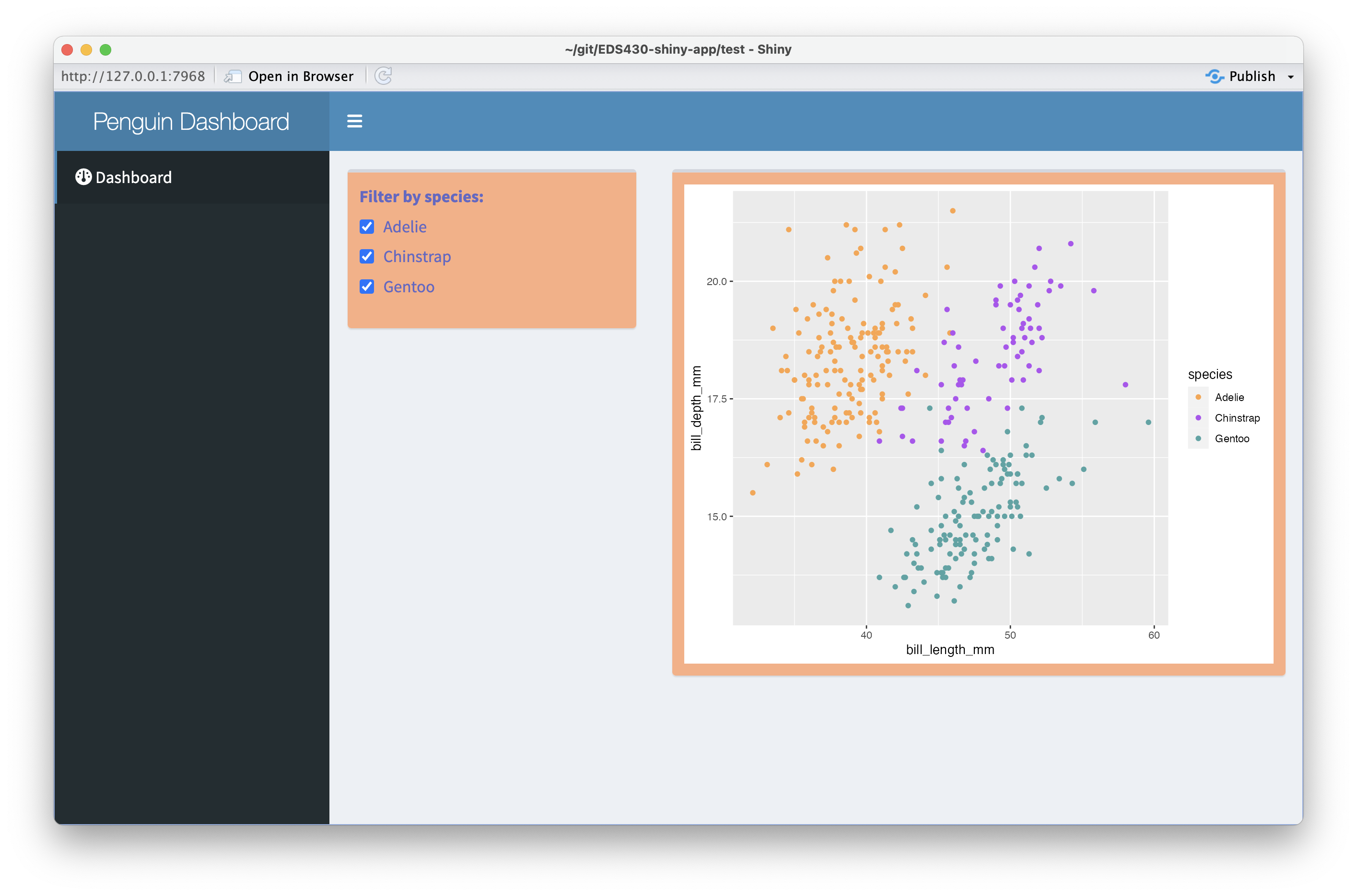
~/css-dashboard/ui.R
#........................dashboardHeader.........................
header <- dashboardHeader(

  # add title ----
  title = "Penguin Dashboard"

) # END dashboardHeader

#........................dashboardSidebar........................
sidebar <- dashboardSidebar(

  # sidebarMenu ----
  sidebarMenu(

    menuItem(text = "Dashboard", tabName = "dashboard", icon = icon("gauge"))

  ) # END sidebarMenu

) # END dashboardSidebar

#..........................dashboardBody.........................
body <- dashboardBody(

  # link stylesheet
  tags$head(
    tags$link(rel = "stylesheet", type = "text/css", href = "styles.css"),
  ),

  # tabItems ----
  tabItems(

    # dashboard tabItem ----
    tabItem(tabName = "dashboard",

            # fluidRow ----
            fluidRow(

              # input box ----
              box(width = 4,

                  checkboxGroupInput(
                    inputId = "penguin_species",
                    label = "Filter by species: ",
                    choices = c("Adelie", "Chinstrap", "Gentoo"),
                    selected = c("Adelie", "Chinstrap", "Gentoo")

                  ) # END checkboxGroupInput

              ), # END input box

              # output box ----
              box(width = 8,

                  plotOutput(outputId = "penguin_plot")

              ) # END output box

            ), # END fluidRow

    ) # END dashboard tabItem

  ) # END tabItems

) # END dashboardBody

#..................combine all in dashboardPage..................
dashboardPage(header, sidebar, body)
Okay, we wrote and applied some CSS styling to our apps, but what about Sass? You don’t need to write any Sass at all, however, it provides a number of benefits, including helping to reduce repetition.
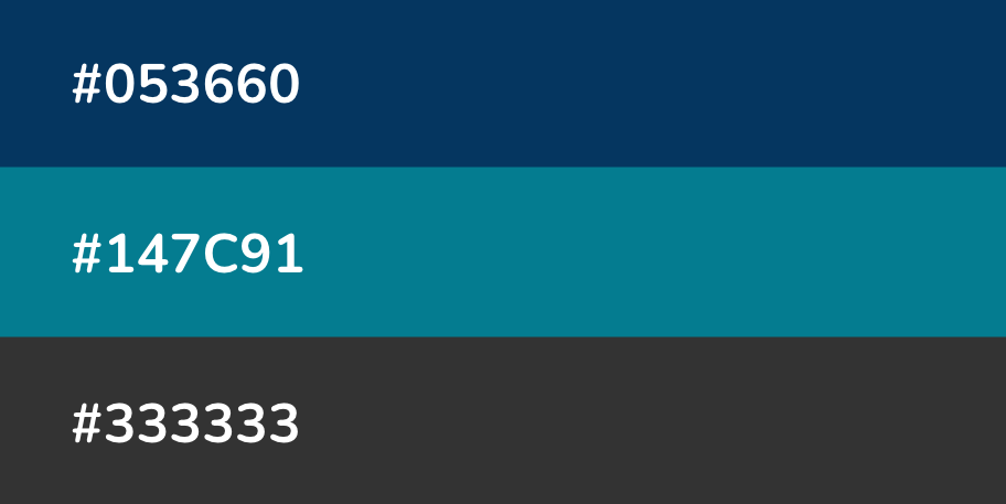
For example, let’s say you’re working on an app that uses three primary colors throughout:
You might imagine how often you’ll need to type those HEX codes out as you developing your stylesheet…it can get annoying rather quickly.
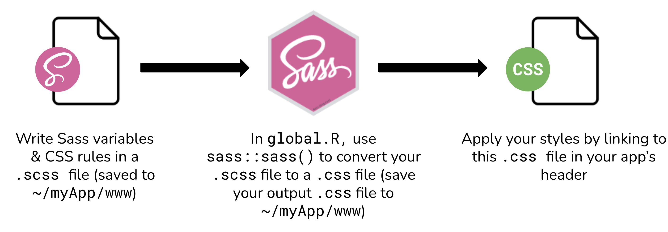
To style apps using both Sass and CSS, you’ll follow this general workflow:
(1) Create a .scss file inside ~/myApp/www/ (either through the terminal using the touch command, or using RStudio’s New File > Text File button). Write both your Sass variables and CSS rules in your .scss file (Note: you can write both Sass & CSS in a .scss file, but only CSS in a .css file)
(2) Compile (i.e. convert) Sass to CSS in global.R (or, if using a one-file app, at the top of your script before you define your UI) using the the sass() function from the {sass} package – this will generate a .css file that our shiny app can actually use. Be sure to save your .css file to your app’s /www directory.
(3) Apply your styles to your app by linking to to your .css file in your app’s header.
Because web browsers can only interpret CSS (not Sass), we need to compile our Sass to CSS. We’ll do this using the sass() function from the {sass} package in global.R. The sass() function requires two arguments: a sass file input and a file path + named .css file output.
We also need to apply our styles to our app by linking this newly-generated .css file in our app’s header.
Note: After running your app, you should see a styles.css file appear in www/ – it should look quite familiar, except all of our Sass variables have been converted to CSS.

~/two-file-app/global.R
# LOAD LIBRARIES ----
library(shiny)
library(sass)
# ~ additional libraries omitted for brevity ~

# COMPILE CSS ----
sass(
  input = sass_file("www/styles.scss"),
  output = "www/styles.css",
  options = sass_options(output_style = "compressed") # OPTIONAL, but speeds up page load time by removing white-space & line-breaks that make css files more human-readable
)

# ~ additional global.R objects omitted for brevity ~~/two-file-app/www/styles.css
@import url("https://fonts.googleapis.com/css2?family=Karma&family=Prompt:wght@200&display=swap");
body {
  background-color: #8ca376;
  color: #f1f7eb;
}

h2 {
  letter-spacing: 5px;
  font-family: "Karma", serif;
}

h4 {
  color: #525cd1;
  font-family: "Karma", serif;
}

p {
  font-family: "Prompt", sans-serif;
}

a {
  color: #E59C5E;
}

.navbar-default {
  background-color: #f0eaa5;
}

.btn.default.active {
  background-color: #8ca376;
}