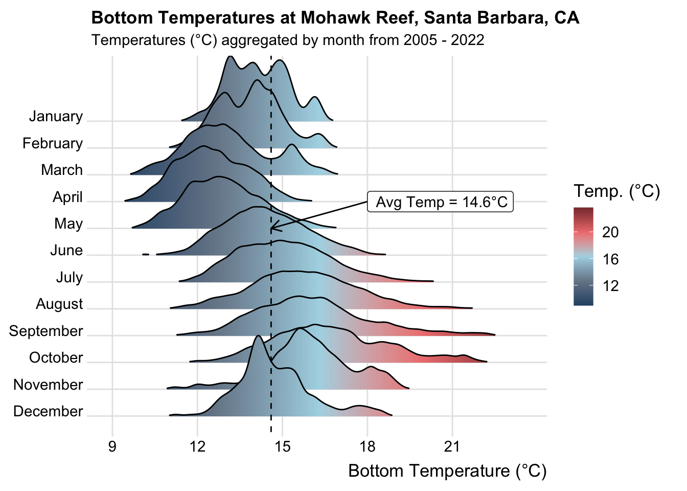
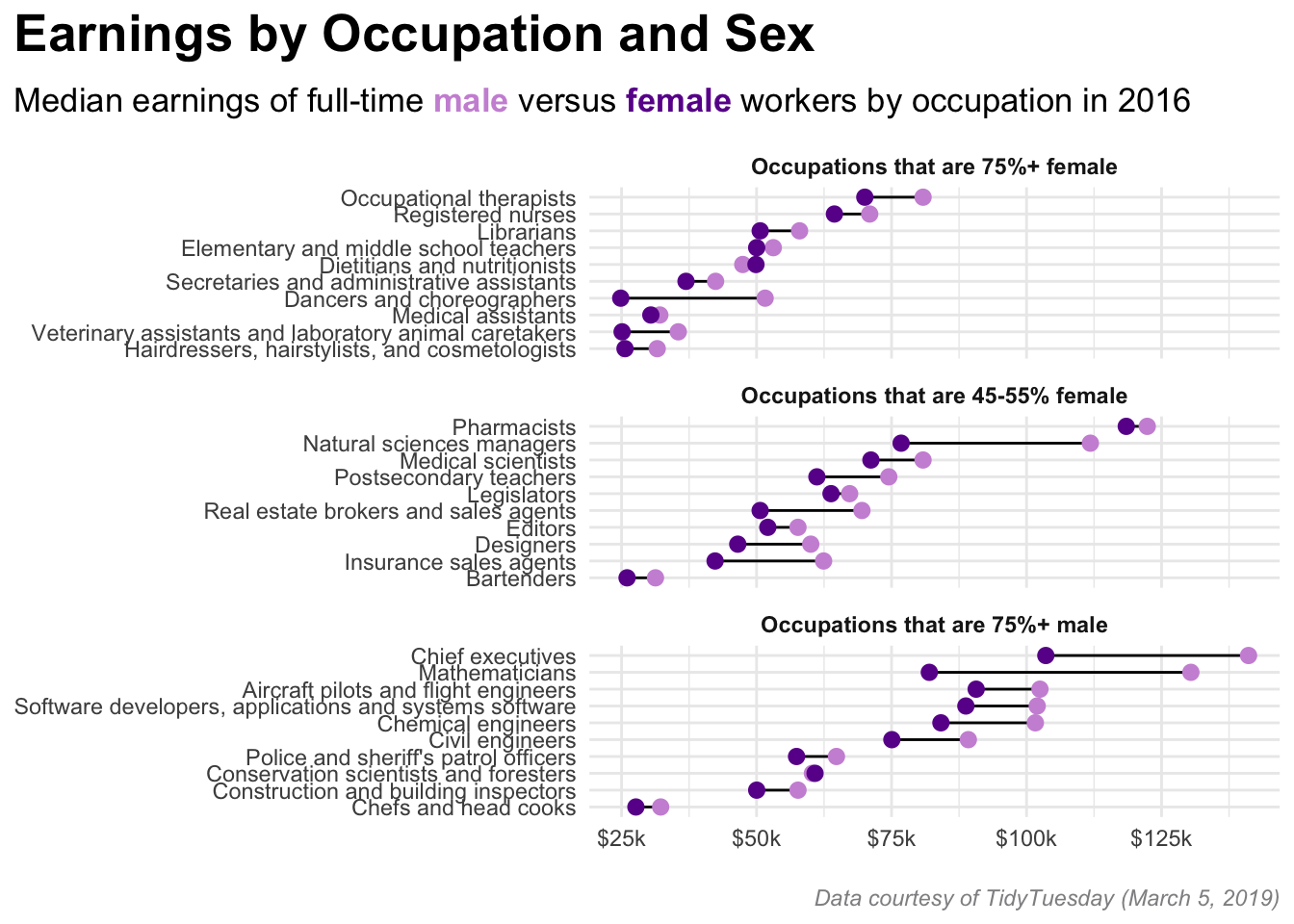
#..........................load packages.........................
library(tidyverse)
library(cowplot)
library(showtext)
#..........................read in data..........................
drought_clean <- readRDS(here::here("clean-data", "us_drought.rds"))
#......................import google fonts.......................
# load Google Fonts: https://fonts.google.com/ ----
sysfonts::font_add_google(name = "Alfa Slab One", family = "alfa") # name = name as it appears on Google Fonts; family = a string that you'll refer to your imported font by
sysfonts::font_add_google(name = "Sen", family = "sen")
# automatically use {showtext} to render text for future devices ----
showtext::showtext_auto()
# tell showtext the resolution for the device ----
showtext::showtext_opts(dpi = 300)
#..........................color palette.........................
colors <- c("#4D1212", "#9A2828", "#DE5A2C", "#DE922C", "#DEC02C",
"#152473", "#243CB9", "#5287DE", "#77A3EA", "#ABCAFA")
#..............................plot..............................
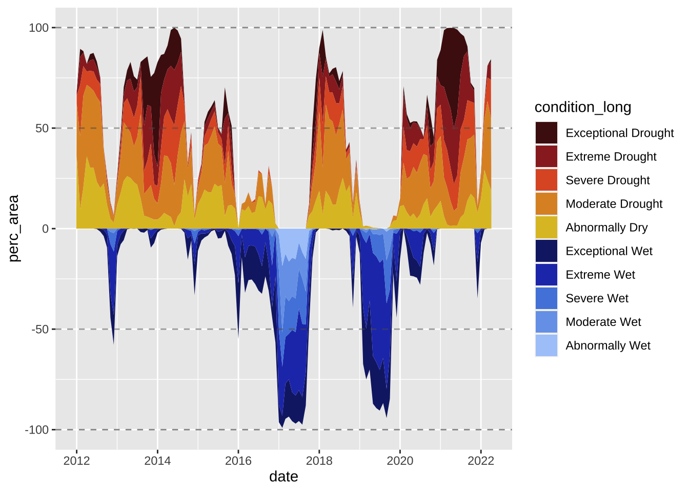
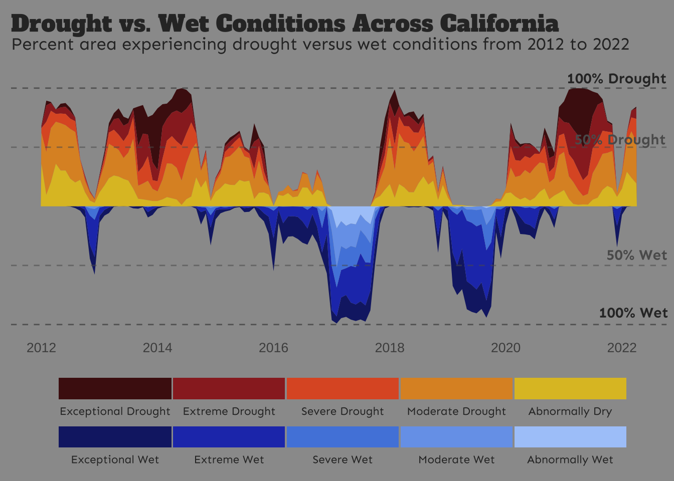
ca_plot <- drought_clean |>
# filter for CA ----
filter(state_abb == "CA") |>
# make wet condition values negative by multiplying by -1 ----
mutate(perc_area = ifelse(test = grepl("D", condition) == TRUE, yes = perc_area, no = perc_area * -1)) |>
# initialize ggplot ----
ggplot(aes(x = date, y = perc_area, fill = condition_long)) +
# create stacked area chart & horizontal lines ----
geom_area() +
geom_hline(yintercept = 100, color = "#303030", alpha = 0.55, linetype = 2) +
geom_hline(yintercept = 50, color = "#5B5B5B", alpha = 0.55, linetype = 2) +
geom_hline(yintercept = -50, color = "#5B5B5B", alpha = 0.55, linetype = 2) +
geom_hline(yintercept = -100, color = "#303030", alpha = 0.55, linetype = 2) +
# set colors ----
scale_fill_manual(values = colors) +
# titles ----
labs(title = "Drought vs. Wet Conditions Across California",
subtitle = "Percent area experiencing drought versus wet conditions from 2012 to 2022") +
# set theme ----
theme_classic() +
# customize theme ----
theme(
# background colors
plot.background = element_rect(fill = "#9B9B9B", color = "#9B9B9B"),
panel.background = element_rect(fill = "#9B9B9B", color = "#9B9B9B"),
# titles
plot.title = element_text(color = "#303030", family = "alfa", size = 17, margin = margin(t = 5, r = 10, b = 5, l = 0)),
plot.subtitle = element_text(color = "#303030", family = "sen", size = 13, margin = margin(t = 0, r = 10, b = 20, l = 0)),
# legend
legend.position = "bottom",
legend.direction = "horizontal",
legend.title = element_blank(),
legend.text = element_text(color = "#303030", family = "sen", size = 8.5),
legend.background = element_rect(fill = "#9B9B9B", color = "#9B9B9B"),
legend.key.width = unit(3, 'cm'),
# axes
axis.title = element_blank(),
axis.text.y = element_blank(),
axis.text.x = element_text(size = 10),
axis.line = element_blank(),
axis.ticks = element_blank()
) +
# update legend layout ----
guides(fill = guide_legend(nrow = 2, byrow = TRUE, reverse = FALSE,
label.position = "bottom"))
#........................add annotations.........................
# NOTE: x & y values based on rendering within this Quarto doc -- you will likely have to adjust them!
annotated_ca_plot <- cowplot::ggdraw(ca_plot) +
cowplot::draw_text(x = 0.915, y = 0.837, color = "#303030", text = "100% Drought", family = "sen", size = 11, fontface = "bold") +
cowplot::draw_text(x = 0.92, y = 0.71, color = "#5B5B5B", text = "50% Drought", family = "sen", size = 11, fontface = "bold") +
cowplot::draw_text(x = 0.945, y = 0.47, color = "#5B5B5B", text = "50% Wet", family = "sen", size = 11, fontface = "bold") +
cowplot::draw_text(x = 0.94, y = 0.35, color = "#303030", text = "100% Wet", family = "sen", size = 11, fontface = "bold")
annotated_ca_plot