We’ve built some really cool apps so far, but they all have a pretty standard and similar appearance. In this section, we’ll explore two packages for creating custom themes for your apps.
Learning Objectives - Theming/Styling Apps
By the end of this section, you should be equipped with:
an understanding of how to use packaged-based tooling for theming and styling your shiny apps and dashboards
Packages introduced:
{bslib}: provides tools for customizing Bootstrap themes directly from R for shiny apps and RMarkdown documents
{fresh}: provides tools for creating custom themes for use with shiny, shinydashboard, and bs4Dash apps
{bslib} & {fresh} both provide tooling for theming your applications
We won’t cover all the major differences here, but you’ll often find the following recommendations:
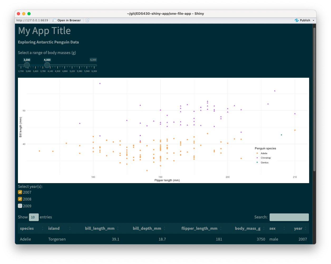
Shiny’s default UI components (e.g. fluidPage(), sidebarLayout()) are styled using Bootstrap, a popular front-end framework for designing responsive web applications. The {bslib} package provides tools for modifying Bootstrap variables.
We can use {fresh} to theme both shiny apps and dashboards, and the process is a little bit more involved than using {bslib}. Let’s practice on both our two-file-app and our shinydashboard
A general workflow for using {fresh} themes
Whether you’re working on a shiny app or a shiny dashboard, you’ll need the following:
(1) a www/ folder within your app’s directory – this is where we’ll save the stylesheet (a .css file) that {fresh} will generate for us
(2) a separate script for building our theme using the create_theme() function – I recommend saving this to scratch/ (it seemed to cause issues when saved anywhere within my app directory)
Importantly, create_theme() takes different variables to set the parameters of your theme, depending on what type of app you’re building: for shiny apps, you’ll need to use bs_vars_* variables, and for shiny dashboards you’ll use adminlte_* variables (examples on the following slides).
There are also a couple ways to apply your finished theme to your app, but we’ll use the method of generating a .css file, then calling that file in our app.
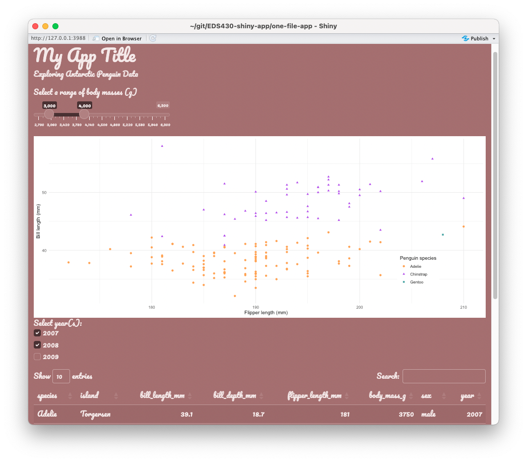
Creating a {fresh} theme for two-file-app
In this example, we update the colors of our app’s body, navbar, and tabPanels using the appropriate {fresh}variables for shiny apps. We specify a file path, two-file-app/www (you’ll need to create the www/ directory, since we don’t have one yet), where our stylesheet (e.g. app-fresh-theme.css, as shown here) file will be saved to. Of course, these color combos are not recommended, but chosen purely for demonstration purposes .
~/scratch/create-fresh-theme-app.R
# load library ----library(fresh)# create theme -----create_theme(theme ="default", # you can supply a bootstrap theme to begin withbs_vars_global( # global stylingbody_bg ="#D2D0CA", # beigetext_color ="#F23ACB", # hot pinklink_color ="#0E4BE3"# royal blue ),bs_vars_navbar( # navbar stylingdefault_bg ="#13CC13", # lime greendefault_color ="#66656C"# gray ),bs_vars_tabs( # tab stylingborder_color ="#F90909"# red ),output_file = here::here("two-file-app", "www", "app-fresh-theme.css") # generate css file & save to www/)
Apply a {fresh} theme to our app
To apply our theme, provide the theme argument of your fluidPage() or navbarPage() with the name of our stylesheet. Note: shiny knows to look in the www/ directory, so you can omit that from your file path, as shown below:
~/two-file-app/ui.R
# navbar page ----ui <-navbarPage(theme ="app-fresh-theme.css",# ~ additional UI code omitted for brevity ~) # END navbarPage
Exercise 1: Use Shiny Assistant to recreate the a {fresh} theme for our shinydashboard
To Do:
Use a new Shiny Assistant session to theme our shinydashboard. Generate colors for the following:
the primary color (header)
sidebar
menuItems
menuItem text
body
Tips:
You may want to ask AI to provide the code in it’s own separate file, rather than itegrate the theme into your app directly (there are a number of ways to apply {fresh} themes, but I find writing the code that generate your .css file in it’s own, separate script to be the cleanest approach).
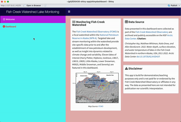
Creating a {fresh} theme, by hand, for shinydashboard
In this example, we update the colors of our app’s header, body, and sidebar using the appropriate {fresh}variables for shiny dashboards. We specify a file path, shinydashboard/www/ where our stylesheet (e.g. dashboard-fresh-theme.css, as shown here) file will be saved to. Again, these color combos are not recommended.
~/scratch/create-fresh-theme-dashboard.R
# load libraries ----library(fresh)# create theme ----create_theme(# change "light-blue"/"primary" coloradminlte_color(light_blue ="#150B5A"# dark blue ),# dashboardBody styling (includes boxes)adminlte_global(content_bg ="#E7B5B5"# blush pink ),# dashboardSidebar stylingadminlte_sidebar(width ="400px", dark_bg ="#57F8F3", # light bluedark_hover_bg ="#BF21E6", # magentadark_color ="#F90000"# red ),output_file = here::here("shinydashboard", "www", "dashboard-fresh-theme.css") # generate css file & save to www/)
Apply a {fresh} theme to our dashboard
To apply our theme, use the fresh::use_theme() function inside your dashboardBody, providing it with the name of your stylesheet. Note: shiny knows to look in the www/ directory, so you can omit that from your file path, as shown below:
~/shinydashboard/ui.R
body <-dashboardBody(# set theme fresh::use_theme("dashboard-fresh-theme.css"),# ~ additional dashboardBody code omitted for brevity ~)